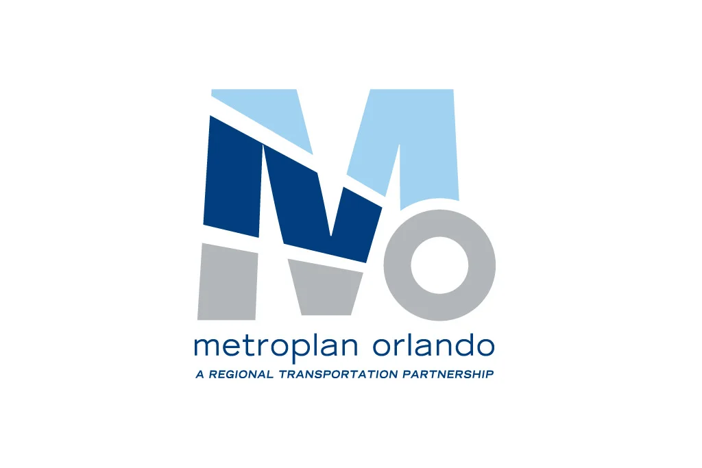
METROPLAN ORLANDO
After working with this client for years on various projects, I was so happy when I heard they had a budget to finally redesign their logo. Their old logo was difficult to use and dated so we were fully aware of the approach we had to have on this project. Since this organization plans the current and future expansion of transportation in Central Florida, we felt it was important to express the idea of movement and control in a subtle way. Utilizing the “M” and “O” from the 2 initials in the name, we created a great little icon that is clean, simple and memorable.